Redesigning Goodreads
OVERVIEW
“Our Goodreads users have the problem that when using the application, they get frustrated with the out of date and clunky design. Our solution should deliver a user-friendly, intuitive solution for our Goodreads users to have a more enjoyable experience with the product. ”
In this project I was tasked thinking of a product I use and researching a current problem they're currently facing, then coming up with a solution to that problem.
Approach
When approaching this project I followed the 5 stages of the Design-Thinking Process. The design thinking process is not as linear as it may seem; the steps overlap and repeat themselves to be extremely useful in finding the users' needs and testing throughout the process.
In conjunction with the Design-Thinking Process, I implemented a UX Design Process which you will follow below in Process.

PROCESS
EMPATHIZE
RESEARCH OUTCOMES
Research
Understanding Goodreads.
According to Goodreads Co-Founder:
A Few Things You Can Do On Goodreads
See what books your friends are reading.
Track the books you're currently reading, have read, and want to read.
Check out book recommendations. Our recommendation engine analyzes 20 billion data points to give suggestions tailored to your literary tastes.
Find out if a book is a good fit for you from our community’s reviews.

Facebook Groups
I posted in several reading/book club facebook groups “What are the your thoughts on Goodreads? What are some pros/cons of the app?” to gather insights.

One-on-One Interviews
I conducted five one-on-one interviews with Goodreads users to dive deeper into pros vs cons of the Goodreads application. Here I learned how frustrated Goodreads users are with the product, but because it’s one-of-a-kind the product, they can’t bear to stray from it. They desperately want an update and they’re complaints to be heard. Next, I take all of the information gathered and begin affinity mapping.

“One of the biggest problems facing Goodreads is that, because of its many sections and clunky web design, it's confusing, at times to the point of being almost unusable. Goodreads is, and has always been, the best for keeping track of book lists.”
https://www.inputmag.com/culture/amazon-goodreads-books-alternative-the-storygraph
DEFINE
2. STRATEGY
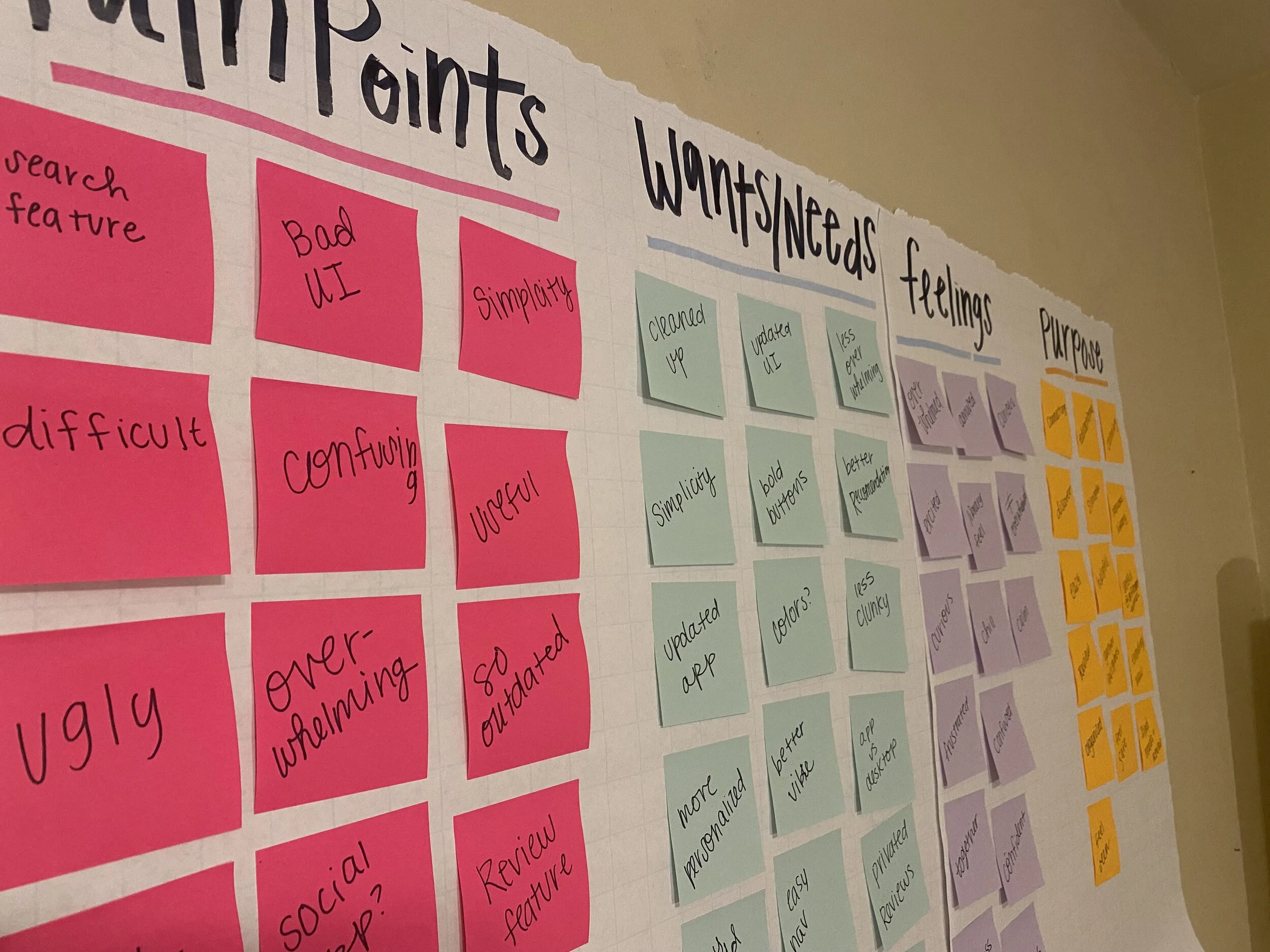
Affinity Mapping
I made an in-depth assessment of my research and I deciphered my research into themes. Affinity mapping helped me draw out insights and determine the priorities of the product. I had a large amount of information from my research, so affinity mapping helped me see what was most important to my users. I learned Goodreads users struggled to simply use the product because it is so overwhelming.


User Needs
Based on insights gathered in research and brought to light during affinity mapping, an empathy map and personas were created to dig deeper into pain points caused using the current Goodreads platform and uncover want/needs for a better experience.
Empathy Map
I created an empathy map in this stage of strategizing because I wanted to further explore and prioritize my users needs. In this step, I began to feel more connected to Goodread users, understanding why they felt so passionately about the product and felt so passion about an update. I based my empathy map on the situation, “Goodreads user wants to discover a new book.” With the empathy map depicting pains of this process such as the product not being user friendly in the situation, complicated, etc.


* My AHA! moment
Creating an empathy map and personas were the pivotal moments in my process, as this is where my users biggest pain points came to life. This was a major moment of clarity and I could see why Goodreads users were desiring updates to this one-of-a-kind product. The product was difficult and frustrating to use, but has so many unique features this is why users keep coming back. It was here where I understood the value of a product update but also understood why users stay loyal through the struggles.
Personas
I created two Goodreads personas in order to understand and empathize with my target audience. Goodreads has a large target audience so created two very different personas to see the similarity between the two then create priority wants/needs then pain points of the product. This step was key in doing so.


Pain Points
Not user-friendly
Out-of-date
Difficult to use
Not cohesive between mobile and desktop
Too complex
Difficult to add friends
Wants/ Needs
Simplicity
Corresponding products
Community access
More user-friendly
Guidance
Community
Problem Statement
Our Goodreads users have the problem that when using the application, the user gets frustrated with the out of date and clunky design. Our solution should deliver a user-friendly and intuitive solution for our Goodreads users to have a more enjoyable experience with the product.

“Goodreads is the worst app in the world. I only use it because it’s one of a kind.”
-Quote from interview
IDEATE
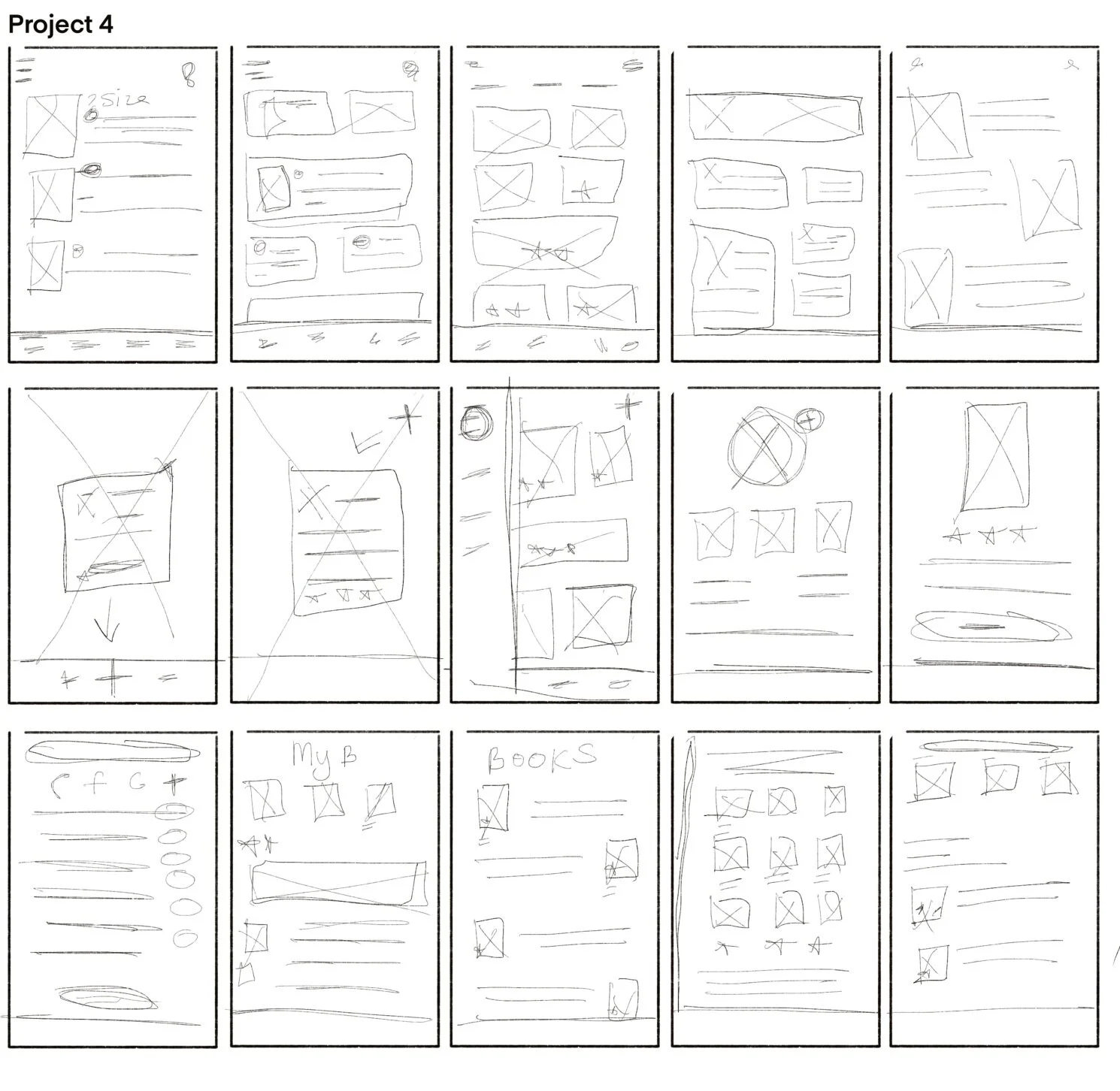
Sketching
Next, I began sketching with my problem statement in mind in order to solve Goodreads users biggest pain points. While sketching my goal was to created a more simplified, updated product. I studied the current Goodreads application and carefully considered all feedback from my research to decide of what was clunky in the product. The consensus was the homepage, so that was a main priority to simply the homepage and create more personalized content for the user. Also to update the UI throughout the application.
DESIGN
3. WIREFRAMING
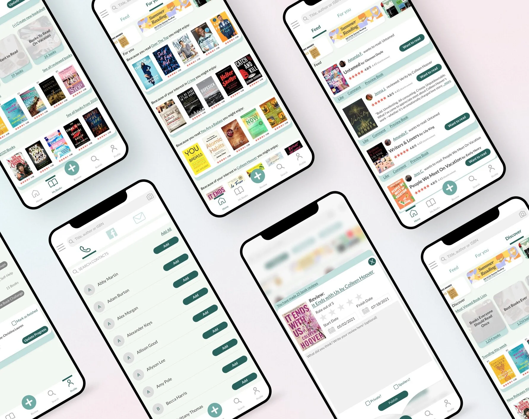
After sketching, I began creating lo-fidelity wireframes of the product. Keeping in mind the question, “How might we simplify the product for the Goodreads users in order to enhance their experience?” So I sectioned the once clunky homepage into 3 separate screens where the user can explore friends activity, personalized content or discover new content.

PROTOTYPE / TEST
4. USABILITY TESTING
A/B TESTING
Once my screens were complete I began A/B testing with Goodreads users. I really wanted to test the idea of sectioning off the once clunky homepage into three separate pages. I also tested an updated review process and simplified UI concept. The new concept was very successful with users, they grew excited for the update.
All 3 updated Goodreads screens were preferred 6/6 times.

HOME PAGE-- Updated Goodreads (left) vs Original Goodreads (right)

BOOK REVIEW-- Updated Goodreads (left) vs Original Goodreads (right)

MENU-- Updated Goodreads (left) vs Original Goodreads (right)
5. FINAL UI
Goodreads users expressed the application felt “outdated” so I prioritized updating the UI of the product. I wanted the updated product to feel familiar, but fresh and welcoming.


Desktop Product


“Goodreads would be so much more enjoyable with this update.”
-Goodreads user
*Look Back
Looking back on this project, if I had more time I would want to talk to even more Goodreads users when conducting user interviews. I had a ton of information but I don’t believe you can ever have enough information. I believe having a range of experienced users, from long time members to new users, gave me to opportunity to see different perspectives of Goodreads. Experienced users may say things about Goodreads’ growth and updates through the years, while new users may have never seen an update, so they hate the one version of the platform they’ve seen. I didn't think of this until doing user tests on my final prototype, but it would have given me interesting insights in the beginning of the process.
A major takeaway from this project is to think of all types of users and possibilities in the beginning of the process and to always explore them even if they sound completely out of the box at the time.